The following healthcare social media infographic created by Appature highlights how healthcare marketers are utilizing twitter in healthcare to reach their audiences.
Read More
Healthcare Infographics | HIT Consultant
The HIMSS12 Infographic
HIMSS12 infographic highlighting some of the key metrics associated with this year's HIMSS12 in Las Vegas
Yesterday HIMSS released their very first infographic highlighting some of the key metrics associated with this year's event. HIMSS is claiming this year's HIMSS12 broke the world record for tweet volume at a healthcare conference. Some of the highlights of the following infographic include:
HIMSS12 averaged 167 tweets per hour
Biz Stone’s keynote alone generated 7,595 tweets – with
Read More
Digital Healthcare Where Are We Now? Infographic
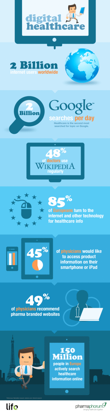
Infographic created by Iron Mountain on digital healthcare that highlights the time consuming and expensive task of converting paper records to EMRs that is not addressed by Meaningful Use.
Read More
Pre-Reform Impact of Self-Pay Patients on US Hospitals
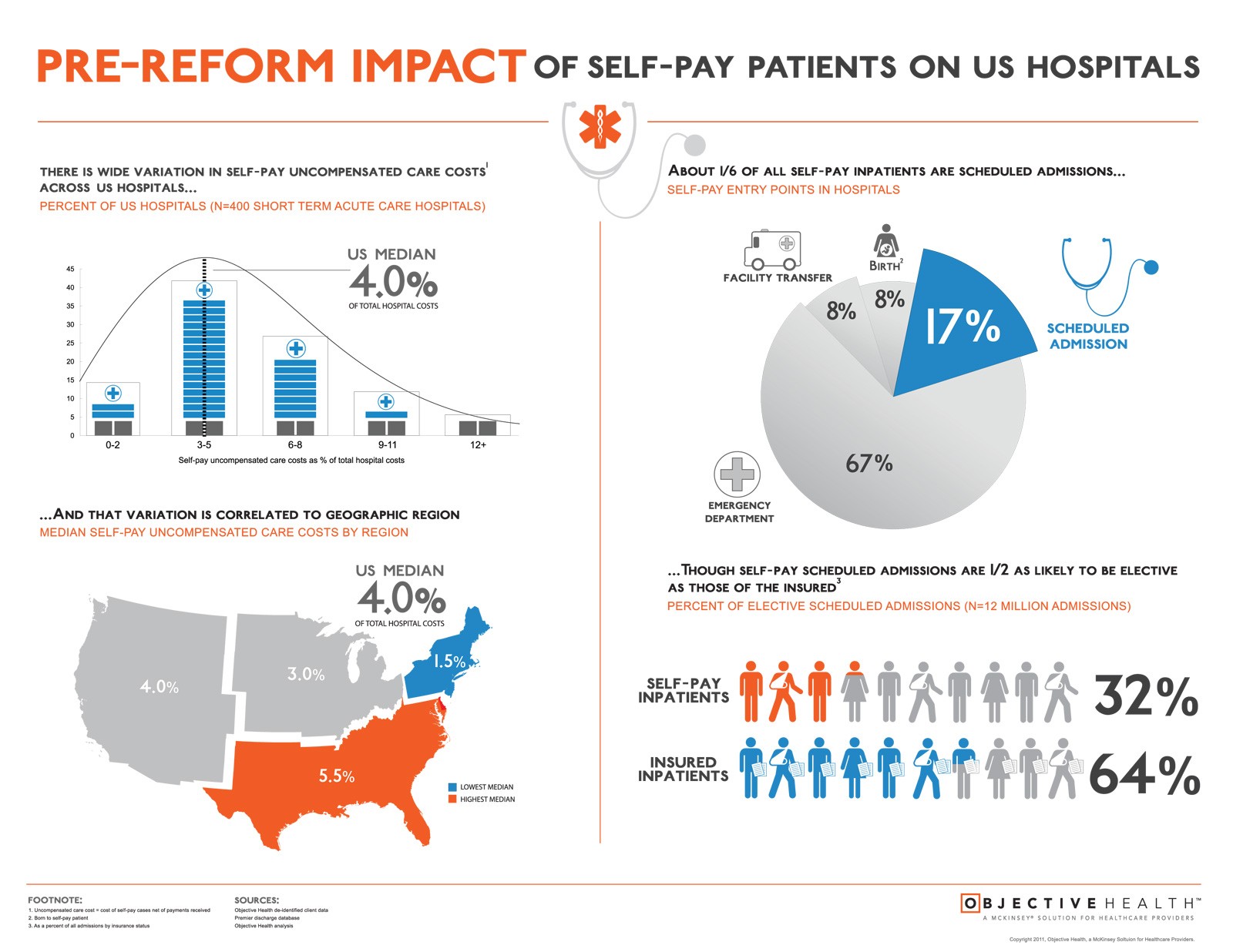
Pre-reform, many hospitals experience significant uncompensated care costs from self-pay patients. The following infographic from Objective Health illustrates the variation in self-pay uncompensated care costs across US hospitals and regions.
Read More
Physician-Patient-Communication Infographic
From Verilogue's collection of over 70,000 physician-patient communication comes a new infographic depicting the communication statistics of patients, caregivers and their physicians.
Read More
Pharma Marketing to Physicians Infographic
Pharma marketing to physicians infographic highlights how companies to understand how physicians are increasing their interest in new media for personal
Pharma Companies need to employ a multichannel approach to fulfill their physicians’ marketing objectives in 2012. Digital in this scenario is becoming the big trend with innovative and integrated solutions. Mobile, Video and Social Network, in fact represent today a commonplace for physicians, becoming part of their daily practice. The
Read More
Is mHealth Poised to Explode? Infographic
The following infographic provides the statistics to how mHealth is poised to explode in terms of growth and it's impact on our healthcare system and patients.
Read More
Infographic: EHR vs. Traditional Paper Records
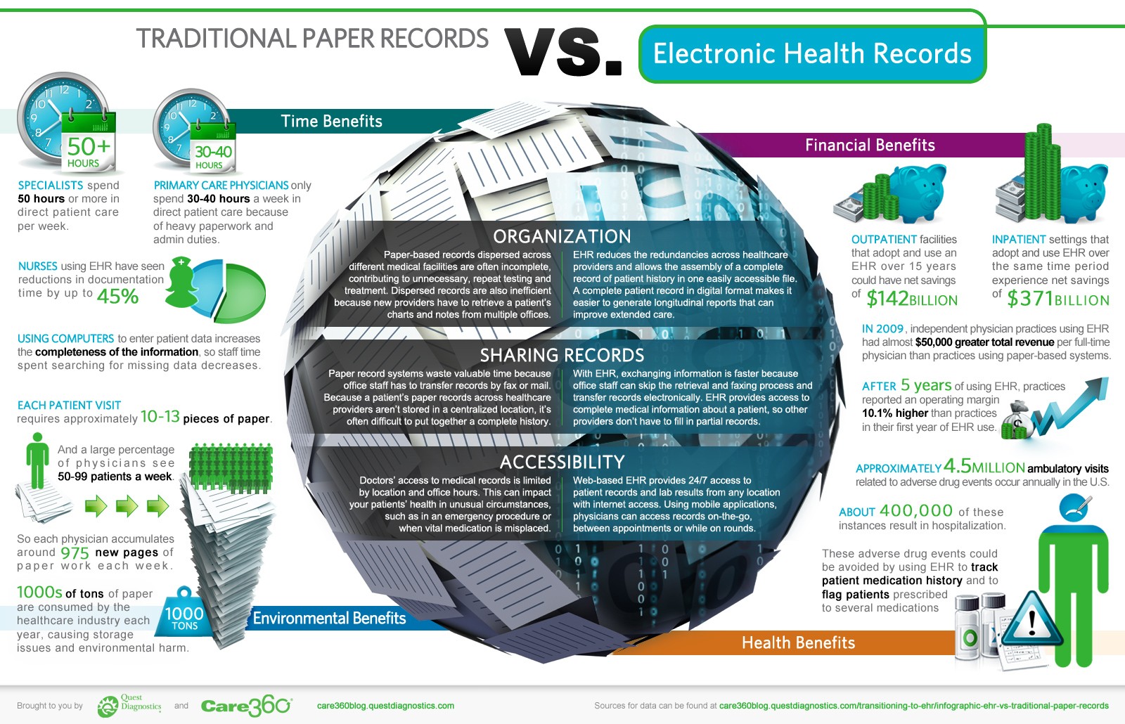
Infographic from Quest Diagnostics Care 360 that compares the differences between EHR vs. traditional paper records
There are many differences between electronic health records (EHR) and traditional paper-based medical records – probably more than you would expect. The benefits of an EHR are numerous when you compare physicians’ time and finances, the health benefits for patients and the impact to the environment.
Read More
Infographic:Making Sense of Meaningful Use
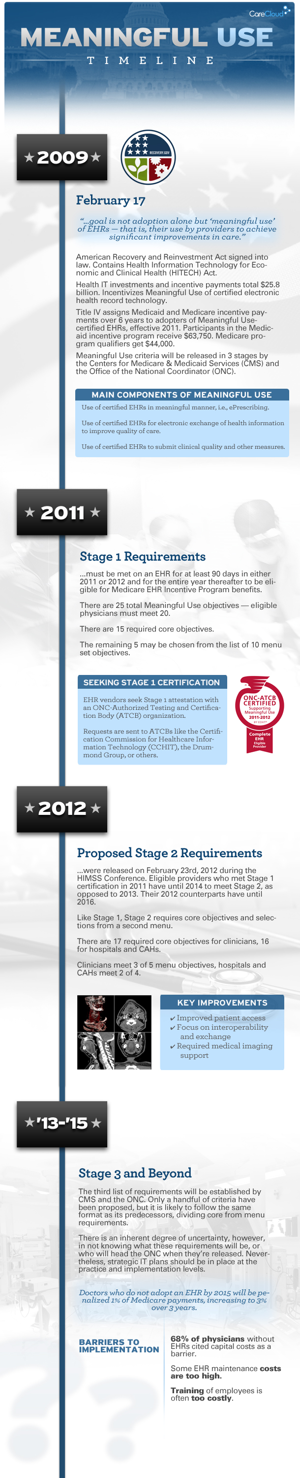
Care Cloud infographic that provides a concise timeline of Meaningful Use outlining the main components, stage requirements, key benefits, etc.
Let's face it, understanding Meaningful Use can be a challenge. There are a number of key requirements that must be meet to achieve each stage of Meaningful Use not including understanding the differences in EHR certification bodies such as CCHIT and Drummond Group. Care Cloud recently created this educational infographic that provides a concise
Read More
Infographic:Social Media in Healthcare
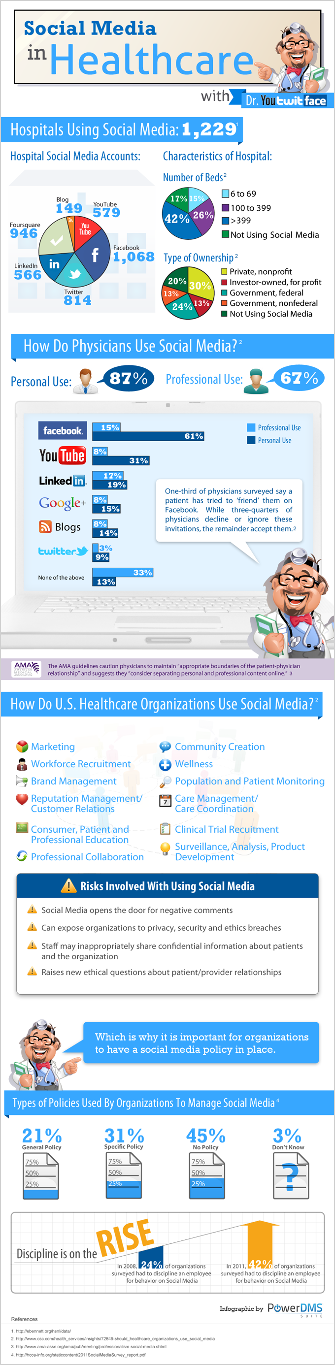
Social media in healthcare is becoming increasingly more prevalent within the healthcare industry. With more hospitals and doctors joining social-media platforms on a consistent basis, it begs the question of “helpful or harmful”? One thing is certain: clear parameters must be established, so professional and personal lines don’t become blurred.
It’s vital to have a well-diversified and comprehensive social-media policy in place, outlining the dos and don’ts for everyone within your facility.
Read More