

If you scan a bright, clear night sky, you will likely pick out familiar shapes. Depending on your creativity, you might see Ursa Major and Minor or perhaps only the Big Dipper and its little brother. But those stars are not only entertaining, they also are important points of navigation used by ancient sailors, the Apollo missions, and even the Mars Rover.
Just as sailors might choose the North Star to guide them, CFOs and healthcare revenue cycle leaders often seek a simple, straightforward way to know if their operations are heading in the right direction. Many leaders will relate something like, “My CFO only cares about net revenue. If it doesn’t impact net revenue, she’s not interested.” It is natural instinct to look for simple ways to manage problems, but a simplistic view can often obscure the true direction.
To effectively manage the revenue cycle, leaders should have a constellation of metrics on their dashboards and, like good sailors, triangulate to determine their position in relation to their organization’s financial goals.
5 Tips for Metrics Dashboards
The key to effective dashboarding is to enable users to look beyond the data points to see meaningful and actionable patterns and trends. Following are some best practices in dashboard design.
1. Choose metrics that are impactful. The user of the dashboard must be able to do something – change a process, add or redirect resources, intervene where there is a problem – with the data that is presented. This may mean having multiple dashboards across the organization, with different metrics targeted for different users. For example, different denials are relevant for different parts of the organization, so having a single unified view is important from a management perspective but targeting authorization denials is vital for a patient access dashboard.
2. Deliver dashboards in a timely fashion. Depending on the metric, the user, and the intended use, that could mean weekly or even daily delivery. Monthly excel dashboards might be helpful for financial reporting but are likely too dated to help operations.
3. Help users interpret the data. Effective use of visualization and other analytical techniques is vital to successful dashboarding. The idea of a dashboard is to impart a select number of data points in a manner that is easy to absorb. Narrowing the focus to those actionable details and then presenting them in ways that users can rapidly observe and analyze them is the key to an excellent dashboard.
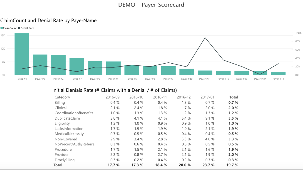
The chart below shows initial denials in green, with the denial rate in black. It would be easy to focus on Payer 1, where there are a high number of denials, but the visualization helps identify Payer 11 as having a higher denial rate, which may be more important for specific purposes.
4. Give users access to more data than fits in the dashboard. If everything goes right, your dashboard will raise more questions than it answers, but it will also inform more focused questions. Layered below the data that gets presented, users should be able to dig into more data, to select more narrow populations or correlate different elements to draw entirely new conclusions.
5. Think of metrics in relation to each other. Like Newton’s Third Law of Motion, revenue cycle metrics tend to have equal and opposite reactions. Understanding those interactions is key to understanding the operation. For example, if bad debt placements exceed a benchmark of 2%, is that because fewer patients are paying at the time of service? Or perhaps the statement process is broken? Or is it because Accounts Receivable (AR) has dropped, pushing more AR into patient balances and subsequently to bad debt? Reviewing metrics in conjunction with each other can help answer those questions and reveal root causes.
When thinking about how to use metrics, it is easy to get lost in the nearly innumerable data points and permutations. To stay on track, revenue cycle leaders should rely on a range of metrics that can provide insight, not as standalone conclusions, but as part of a bigger picture. There is, unfortunately, no single North Star in revenue cycle metrics, but rather a huge canopy of metrics that form bright constellations to guide us.
About the Authors
Peter Angerhofer is a principal at Tegria, the healthcare technology and services company founded by Providence. Peter started his career in health policy but has spent more than 20 years in revenue cycle performance improvement. He has worked with a variety of hospital and physician clients, including prominent academic medical centers and local community hospitals, to deliver measurable financial improvements through operational changes.
Robert Dewar is a leading healthcare executive with more than 25 years of experience working with providers. He has worked with leading academic medical centers and integrated delivery networks to improve collections and manage costs. He currently serves as the Chief Revenue Officer for Geisinger Health System. Previously, Bob has served in leadership roles for APM Consulting and R1. Bob is a graduate of Brown University and the Harvard University Graduate School of Design