
Infographic illustrates the top physician practice challenges, cost pressures, and future focus areas.
Read More
Healthcare Infographics | HIT Consultant
Infographic: The Inefficient State of Supply Chain in Healthcare

Infographic created by GHX illustrates the inefficient state of supply chain in healthcare.
Read More
Infographic: 25th Annual HIMSS Leadership Survey
25th Annual HIMSS Leadership Survey findings and infographic demonstrates the positive impact of health IT.
Today, at the HIMSS Annual Conference and Exhibition in Orlando, HIMSS published the results of the 25th Annual 2014 HIMSS Leadership Survey, which highlights the journey of health IT over the past 25 years. The Survey examines a wide array of topics crucial to healthcare leaders including IT priorities, issues driving and challenging technology adoption and IT security.
The Survey
Read More
Infographic: Top Physician Information Sources by Mobile Device

Infographic illustrates the top physician information sources by frequency of mobile device usage on smartphones/tablets.
As physician practices around the country prepare for significant changes in 2014, many are looking to new technologies and information sources to drive efficiencies while ensuring quality of care. Wolters Kluwer Health, a leading provider of information for healthcare professionals, has depicted these trends in their Physician Information Sources infographic. The
Read More
Infographic: Differences Between ACO Patients & Non ACO Patients
Infographic illustrates the key differences between ACO patients and non-ACO (Accountable Care Organizations) patients created by Addictive Analytics.
The infographic features recent research findings from Arnold Epstein and other researchers comparing ACOs with non-ACO providers using publicly available data from the Centers for Medicare and Medicaid Services, the American Hospital Association’s 2011 Annual Survey of Hospitals, the U.S. census, and the Dartmouth Atlas of Health
Read More
Infographic: The Impact of Meaningful Use on the Mobile App Market
Infographic created by VoiceFirst illustrates how Meaningful Use is driving the mobile app market as more hospitals and healthcare providers meet the Meaningful Use requirements.
Related: 6 Most Commonly Performed Tasks by Doctors on Tablets
Featured image credit: Nicola since 1972 via cc
Read More
HIMSSanity: A Visual Look Inside the HIMSS 2014 Conference Infographic
Are you ready for HIMSS 2014? The following infographic created by CDW Healthcare provides some fun facts and insightful stats about the upcoming HIMSS 2014 Conference.
Read More
Infographic: The Role of Health IT in the Patient Experience
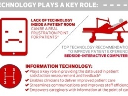
Infographic created by CDW Healthcare illustrates the integral role of health IT in the patient experience and how it can help drive patient satisfaction.
Read More
Infographic: 5 Health IT Trends for 2014
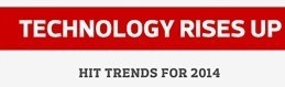
Infographic created by CDW Healthcare illustrates 5 health IT trends that will have a big impact on healthcare's increasingly competitive and cost-conscious environment.
Read More
Health Risk Assessments Are A Powerful Component of Population Health Management (Infographic)

Health Risk Assessments (HRAs) are a powerful component of population health management strategies for healthcare organizations. Therefore, it is important for executives to stay informed on this evolving aspect of healthcare.
Read More