
What You Should Know:
– MDmetrix’s new control charts project daily deaths from COVID-19 nationally and by state, revealing which states are flattening the “daily deaths” curve.
– Currently, none of the states with the highest COVID-related death rates—including Washington State, New Jersey, New York, California, Michigan or Louisiana—have flattened the curve.
Whether you’re a health system executive, a grocery store worker, or a concerned parent, Americans everywhere see the daily stats about deaths due to COVID-19—and we’re all left are wondering what the significance is of those numbers. Are we flattening the curve as a nation, and in my state?
Today, MDmetrix—an AI-powered clinical performance management platform company based in Seattle, one of the nation’s first COVID hot spots—has stepped up to the plate to create easy-to-understand national and state-by-state charts that take daily death rate data tracked by The New York Times one step further: The charts give healthcare leaders, clinicians and regular citizens a way to visualize data on COVID deaths and to separate data “signals” from “noise.”
This is important because an initial drop or spike in death rates may or may not be meaningful or predictable. The charts give us a visual that puts the raw data into context, so we know if a change is simply a variation or a predictable trend.
Control Charts Background/Methodology
The MDmetrix charts were developed based on methodology from Lloyd Provost, a leader in the application of control charts for healthcare improvement. Provost, a statistician with Associates in Process Improvement and senior fellow of the Institute for Healthcare Improvement (IHI), is an advisor to MDmetrix. Provost is also the co-author of the seminal text in this field, the Healthcare Data Guide, and has been a sought-after teacher, thinker and consultant for decades. Provost worked with colleagues Rocco Perla and Shannon Provost to apply the control chart method to COVID-19 daily reported death data.
COVID-19 Hot Spot Related Death Rates Projections
Nationally, MDmetrix’s charts show that the United States’ daily deaths are on an exponential growth curve. Highlights from recent data for the states with the highest number of total deaths include:
New York
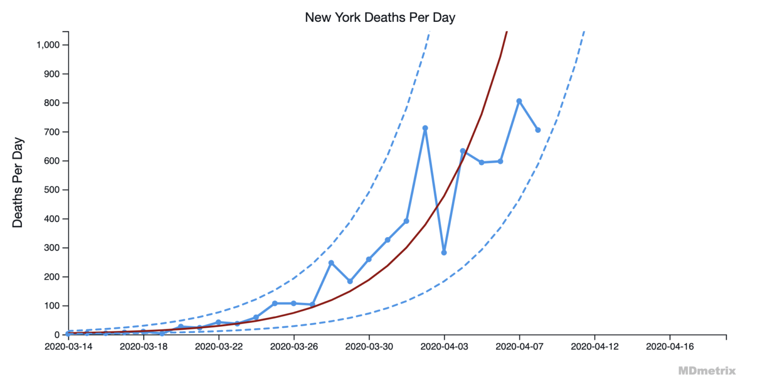
– New York state’s daily deaths are still on an exponential growth curve.
New Jersey
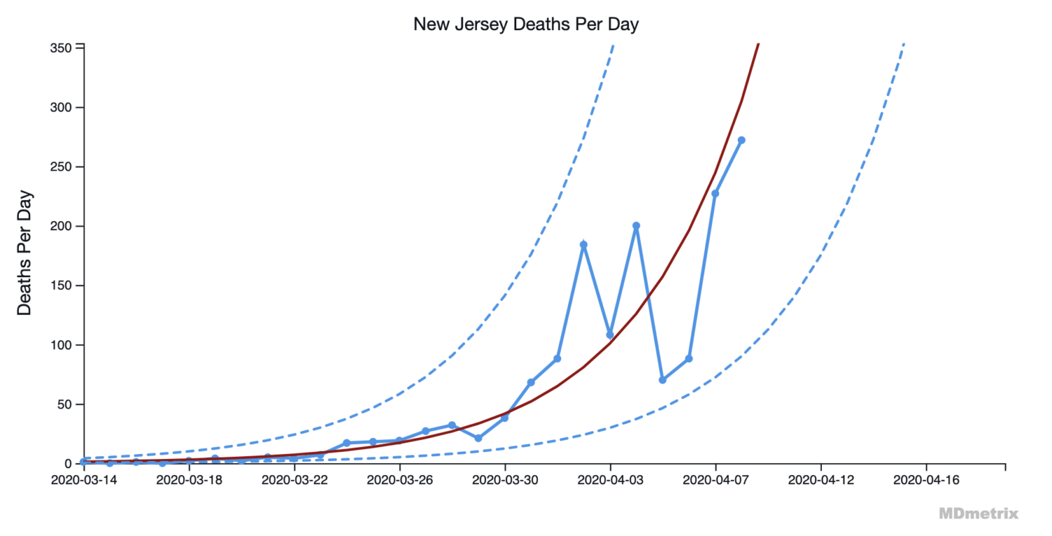
– New Jersey’s daily deaths are still on an exponential growth curve.
California
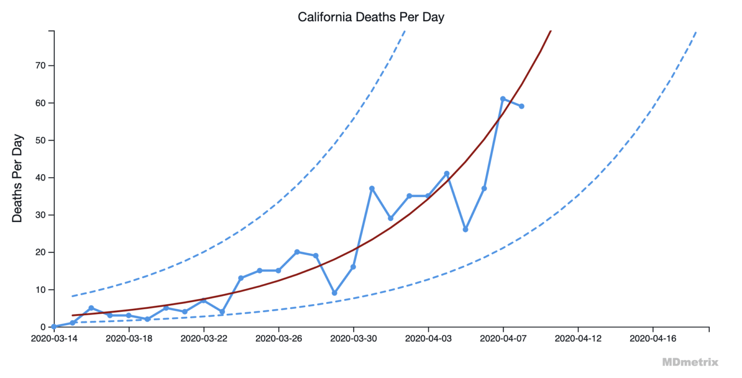
– California’s daily deaths are still on an exponential growth curve.
Michigan
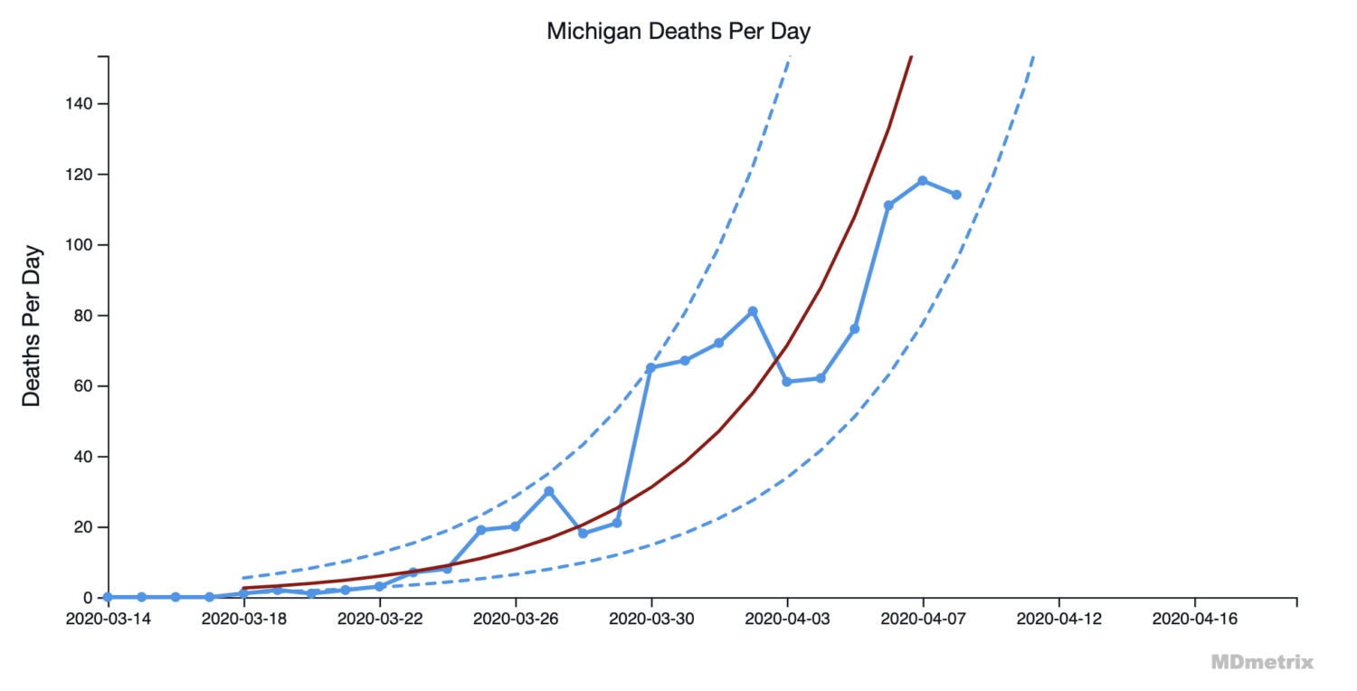
– Michigan’s daily deaths are still on an exponential growth curve.
Louisiana
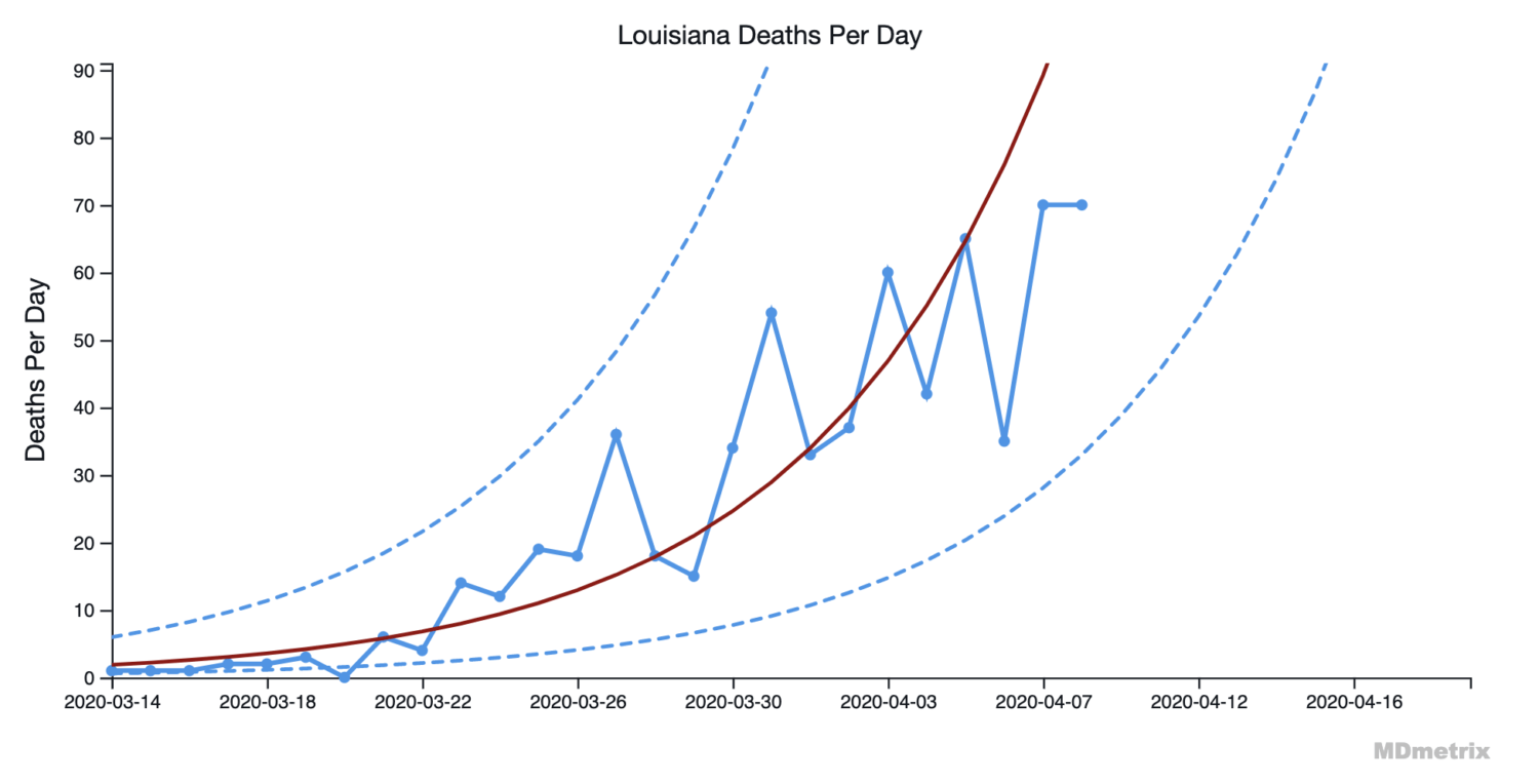
– Louisiana’s daily deaths are still on an exponential growth curve.
Washington State
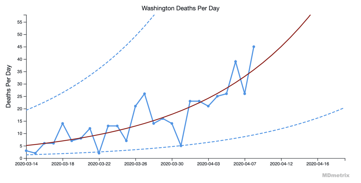
– Washington State’s daily deaths are still on an exponential growth curve.
How to Read these Projection Control Charts
The red line represents an exponential growth curve projection, based on available daily deaths data from The New York Times.
The solid blue dots, joined by the blue line, represent the actual number of COVID-19 deaths per day.
The dotted lines are “control limits” that are mathematically tied to the projected growth rate. If COVID-19 deaths are on a “stable” path of exponential growth, then the solid blue line should stay within the dotted “control limit” lines.
Naturally, the blue line moves back and forth across the red line projection, reflecting expected real-world variation (noise).
“It’s essential that we sift real data signals from random noise so that we focus on what matters as we fight COVID-19,” said Dan Low, MD, associate professor at the University of Washington and chief medical officer of MDmetrix. “Control charts are the best tool for distinguishing signals from noise in real-world medical data.”
Control Chart Access
MDmetrix updates these control charts for the nation and for all 50 states on a daily basis after the NYT data is released each day. You can access those charts at https://www.mdmetrix.com/covid-19-projections.