Loopback Analytics, a health care data integration and analytics company has unveiled its new Loopback Geographic Analysis Dashboard, an interactive analytics tool that allows hospitals to visually assess the quality of post-acute providers in their geographic region.
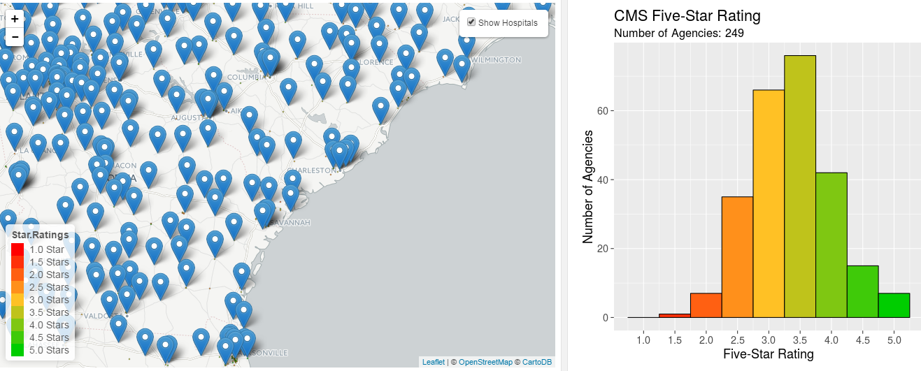
The dashboard features simple ranking criteria, color-coded quality indicators and an interactive map allowing hospitals to see which skilled nursing and home health care providers in their local/regional networks and beyond deliver the highest in quality and efficient care to ensure the best possible patient outcomes.
A Dashboard Tool for Maximizing Reimbursement
As reimbursements shift from fee-for-service to outcomes-based and new bundled payment arrangements rapidly emerge, hospitals are increasingly at financial risk for post-discharge patient outcomes. That means hospital care coordinators need accurate, data-driven insights into the quality and performance of their post-acute network partners in order to ensure maximum reimbursements and avoid penalties.
This dashboard gives care coordinators and post-acute network managers a way to get an initial, high-level view of network quality. The data, sourced from the Centers for Medicare & Medicaid Services (CMS) five-star quality system, is presented in an interactive map that makes it far simpler to navigate and digest than most currently available formats.
Easy Access to ‘Insider’ Data
The dashboard is designed to bring transparency into the health care marketplace, providing an easy, innovative and elegant way to help hospitals refine and better manage their post-acute networks. The dashboard is available free of charge and open to the public at https://loopback.shinyapps.io/Loopback_Geographic_Analysis/.